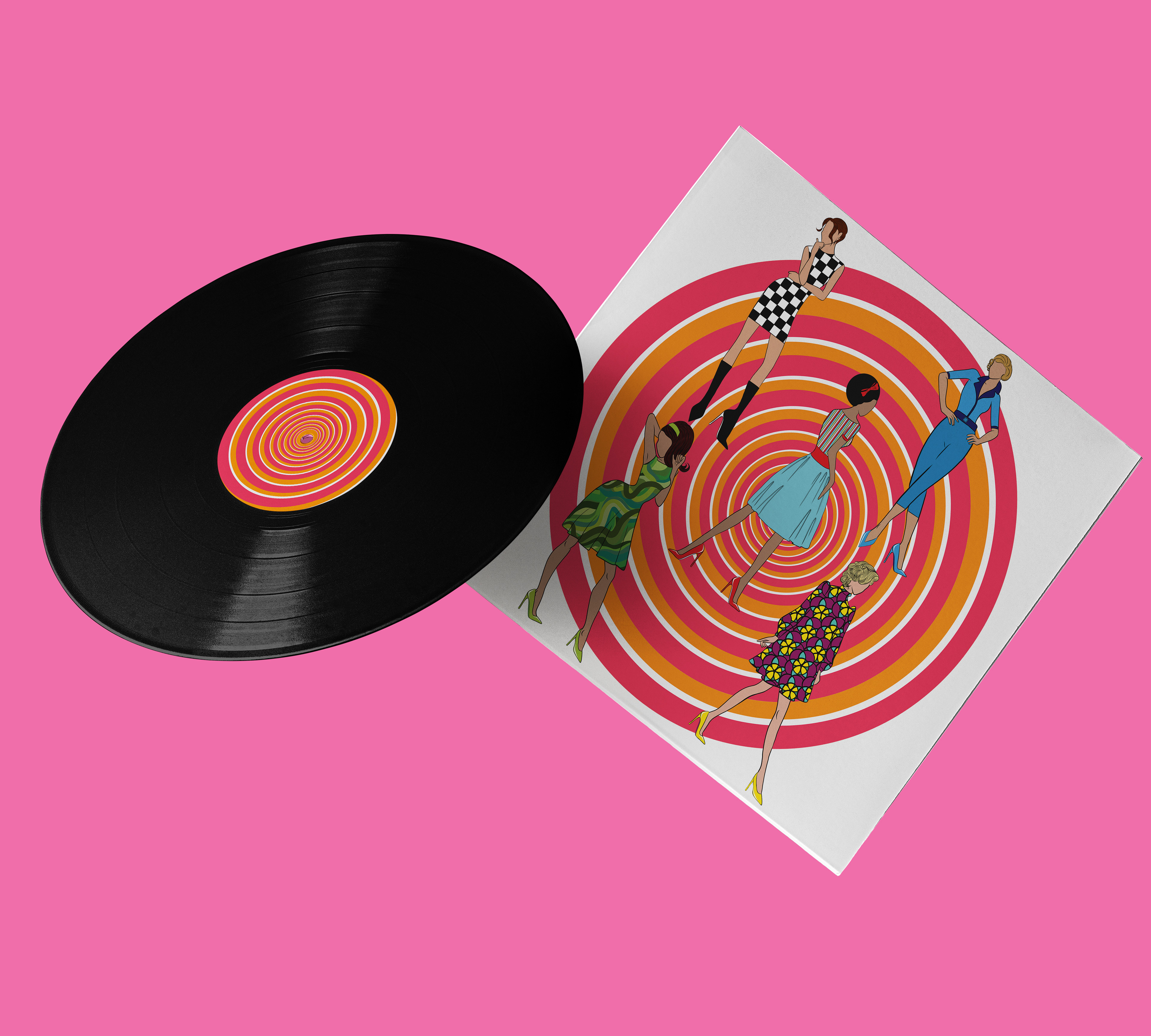

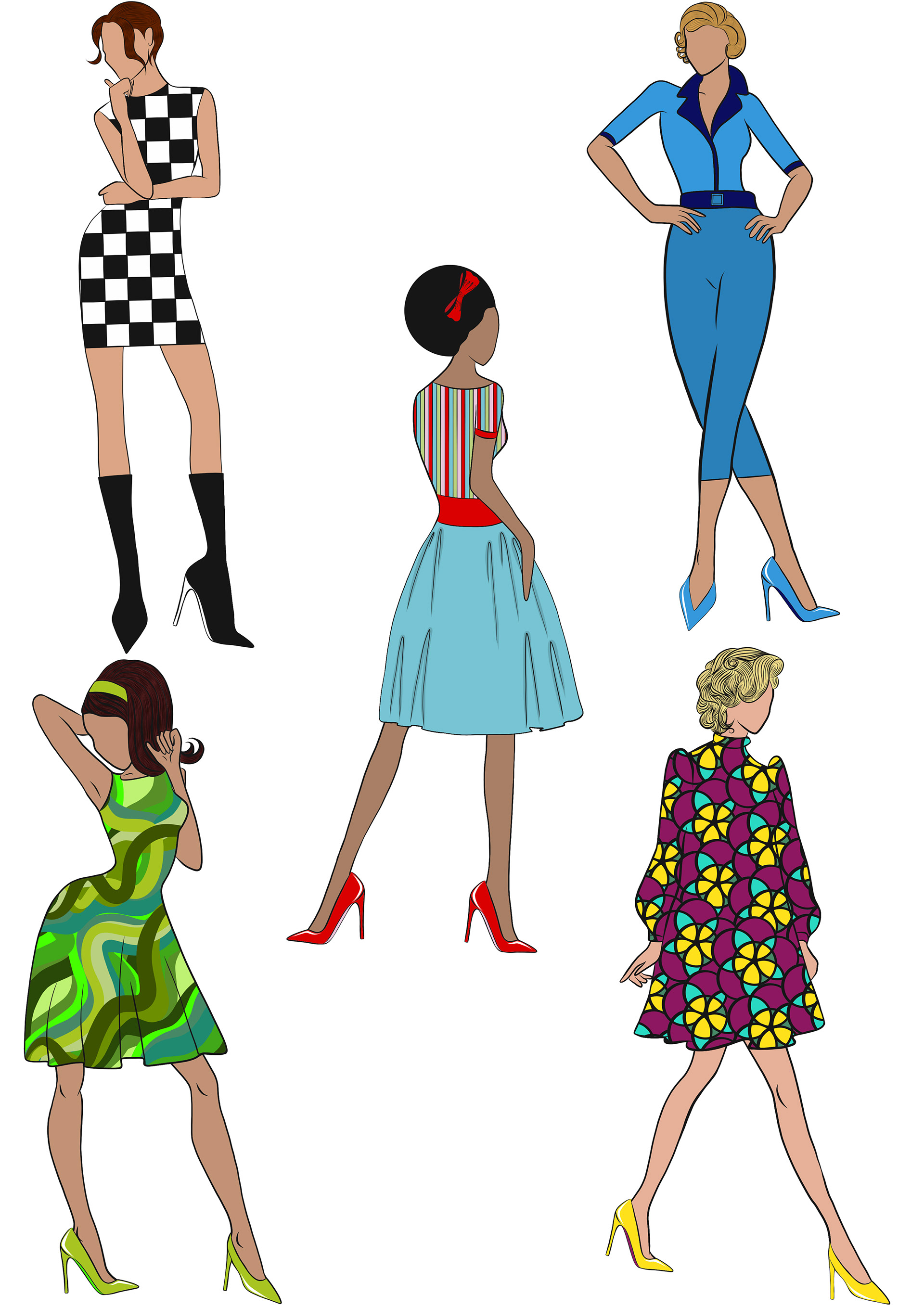
My design represents female empowerment. Independent, strong, beautiful women that step in the right direction, fighting for their rights regardless of race or skin color. I looked into the 60s clothing and hairstyle to represent the time when the song was published. I used the spiral in the background to create an optical illusion. My females are faceless so anyone who sees can feel identified with any of the ambiguous illustrations and interpret the cover as they choose. Following the lyrics of the song, this vinyl represents the message behind Aretha Franklin words, telling the story of heartbreak, to never allow someone to be your priority while allowing yourself to be their option. Not holding on to something that wasn't real and looking forward to knowing something better is yet to come. I managed to submit my work on time and create a few mock-ups of how my final product would look like. I was pleased with the work produced, how comfortable I now feel when proposing and negotiating my ideas and intentions before creating a final design, discussing ideas, and receiving feedback in order to push ideas a little further and refine my work before final production.